


bbdo dallas branding
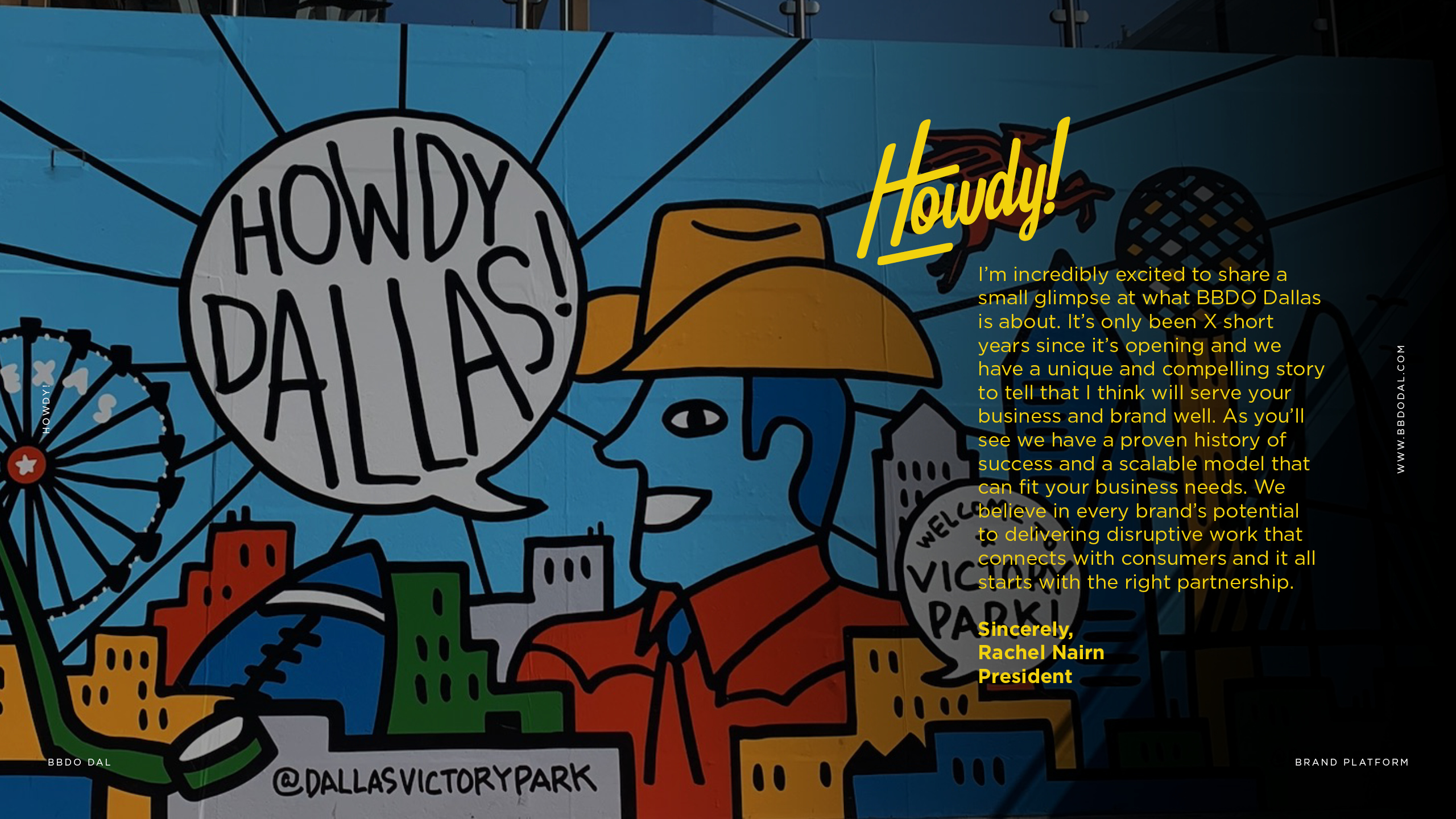
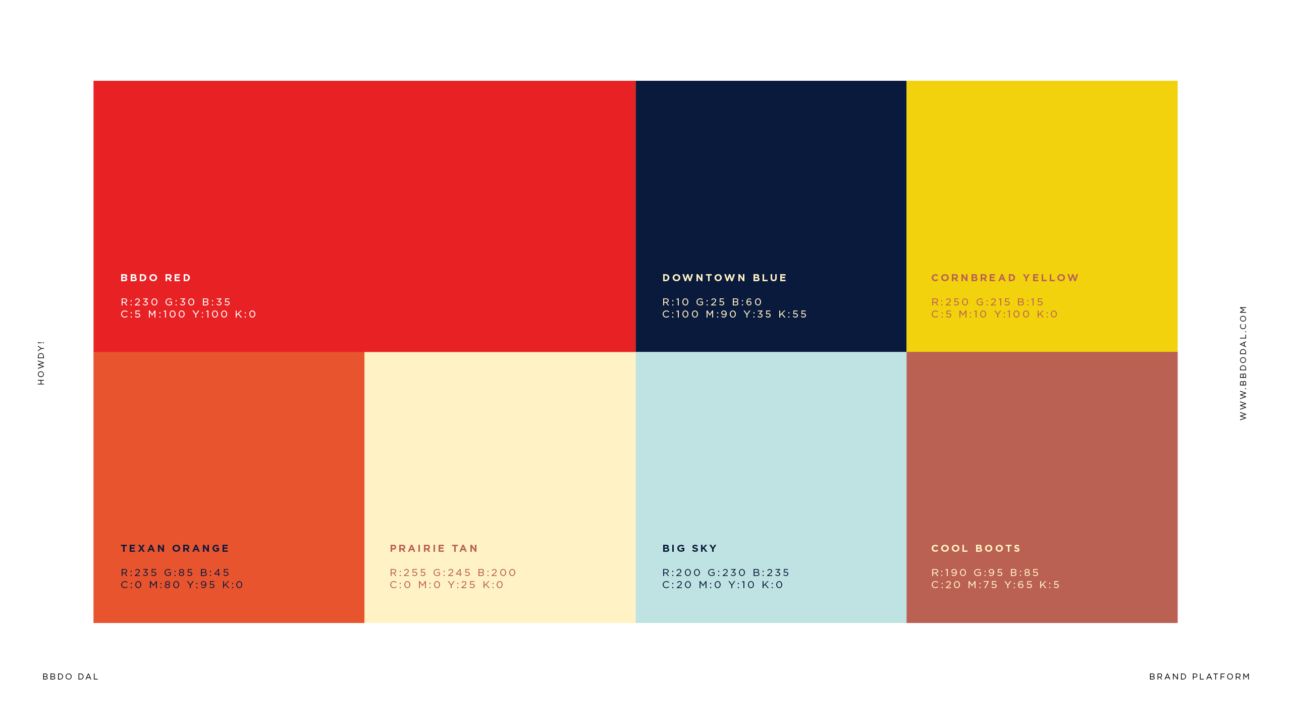
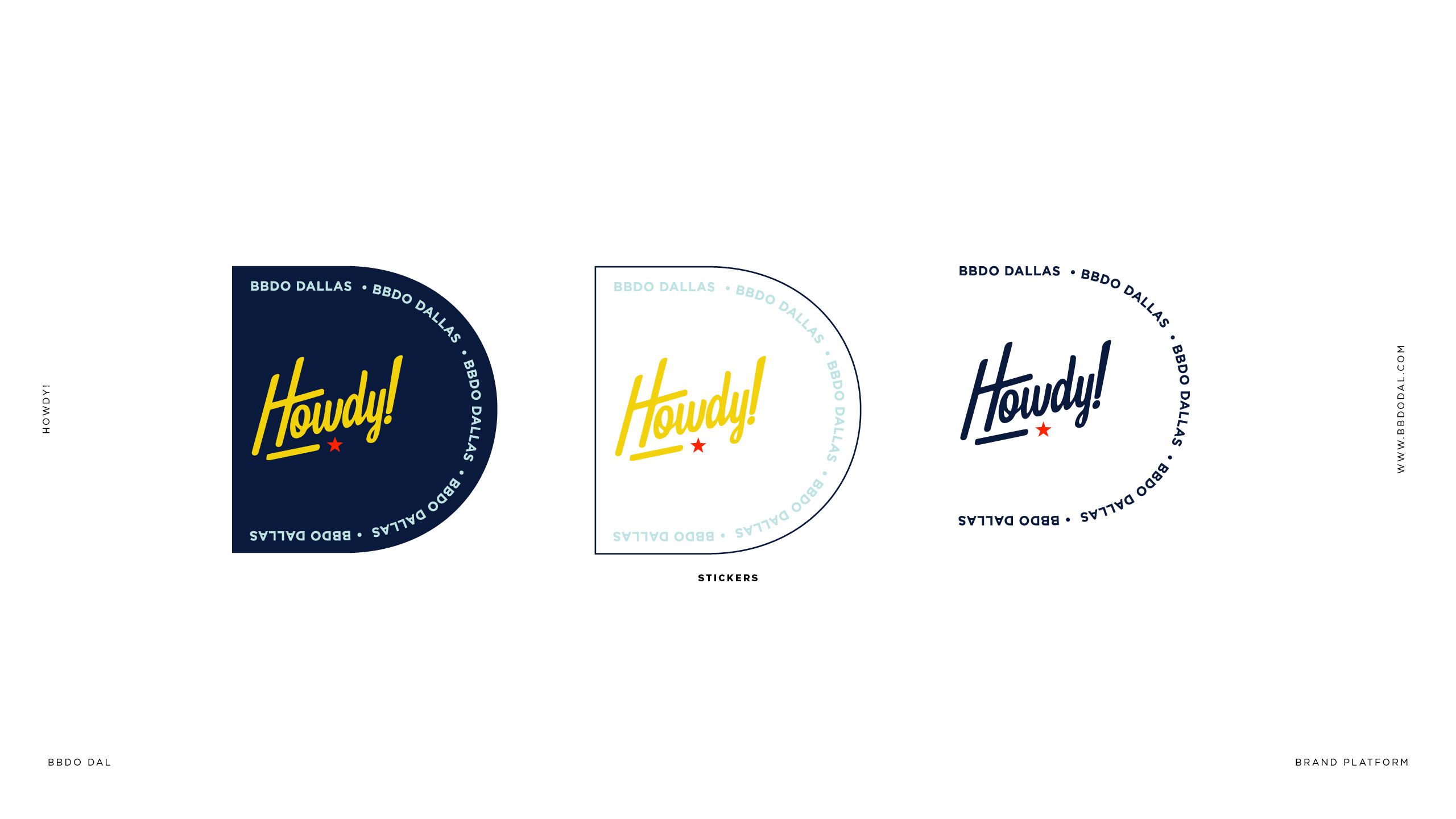
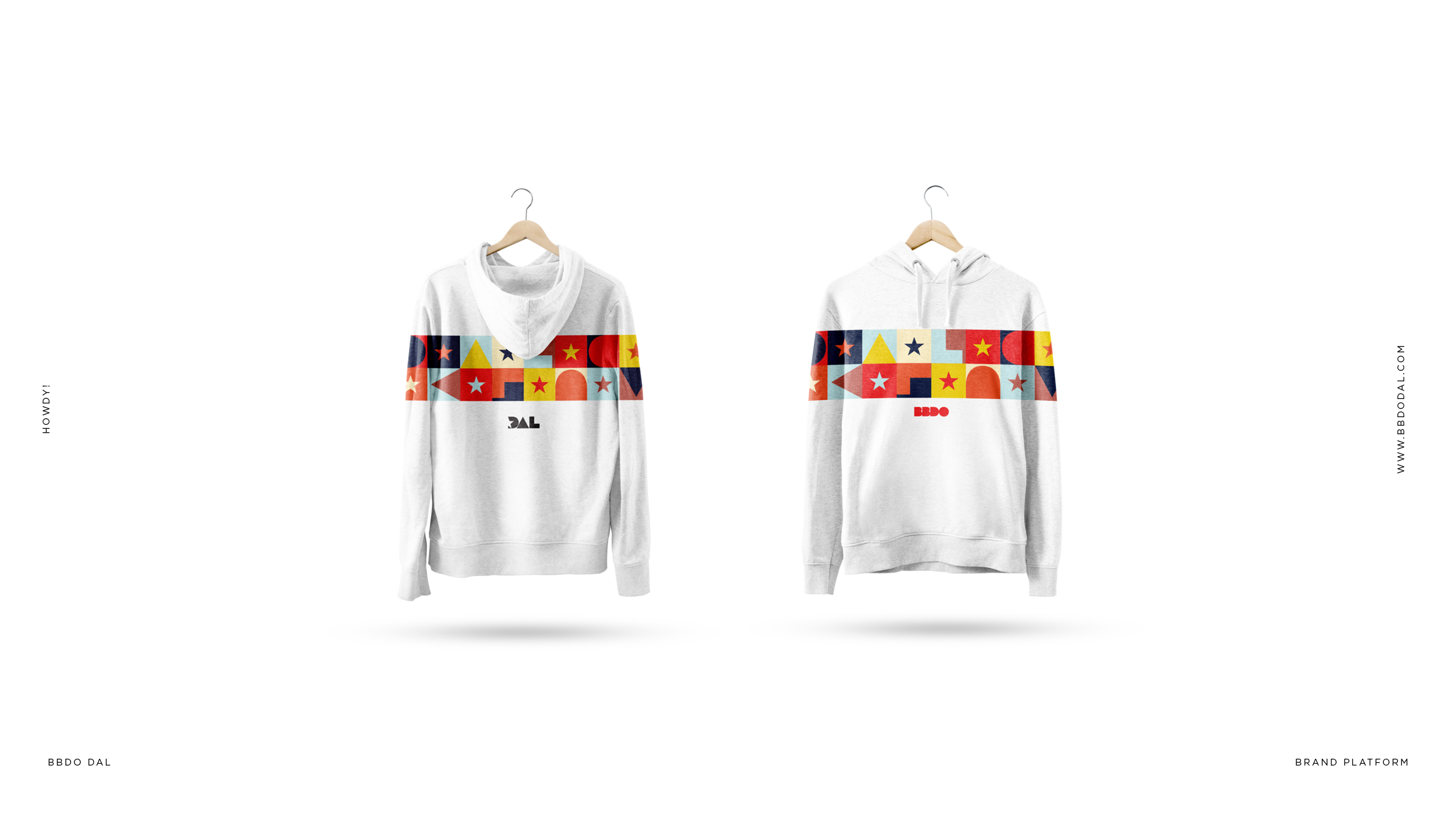
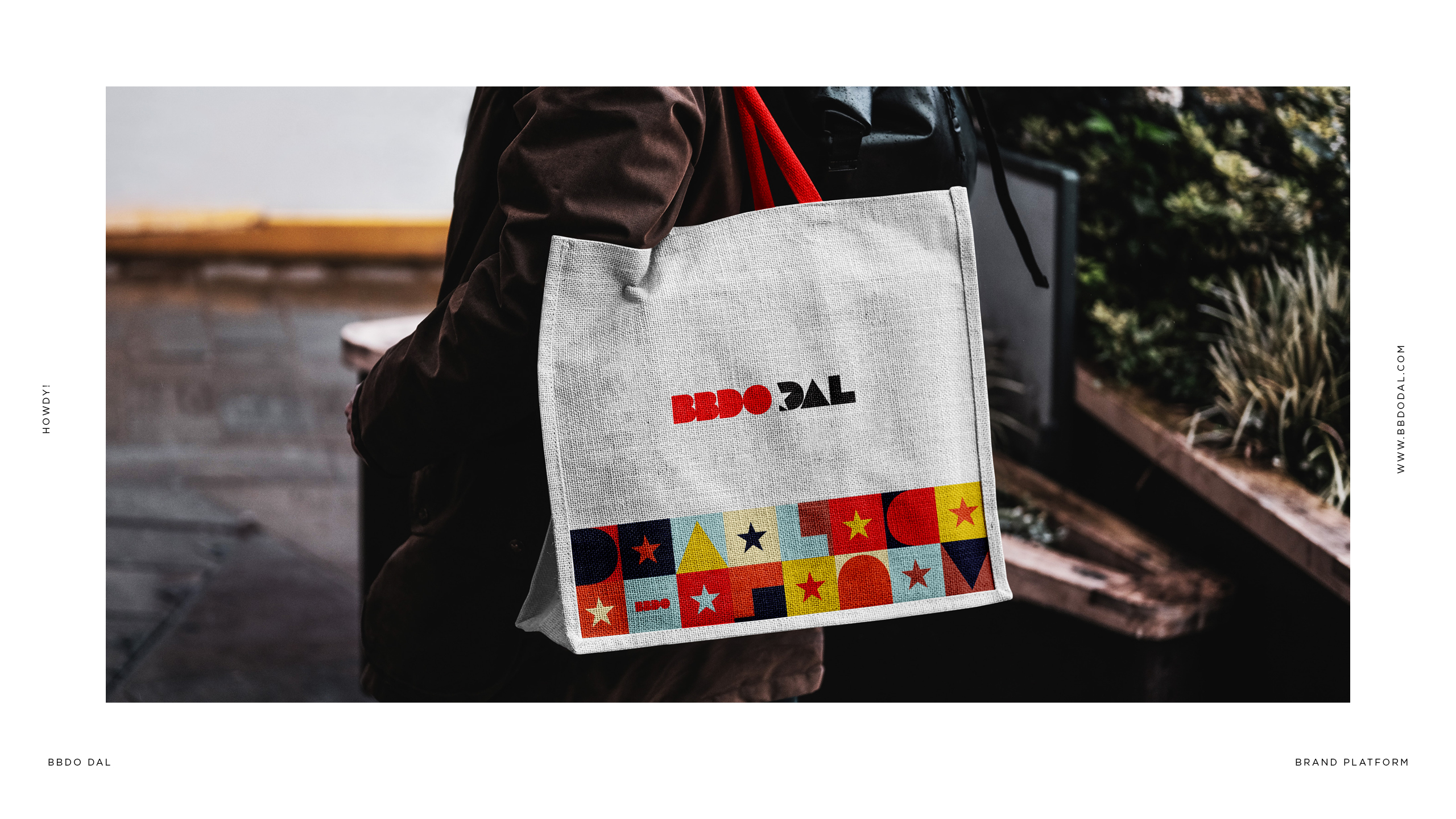
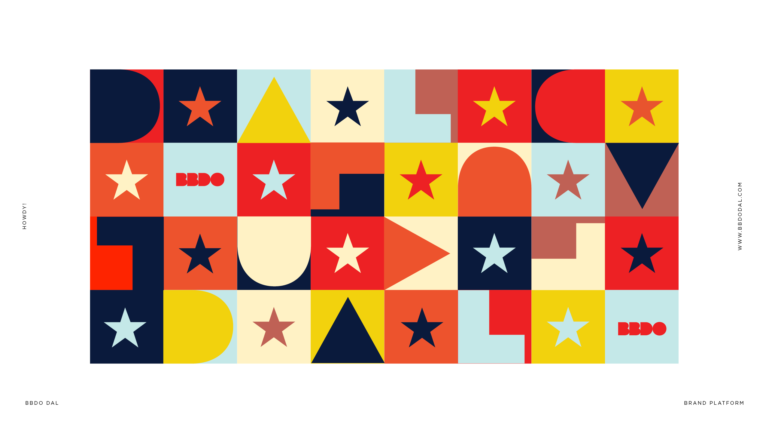
A brand identity for BBDO's Dallas office, built around a warm, unmistakably Texan personality. The wordmark pairs a chunky, rounded BBDO with a sharper, angular DAL, giving the logo two distinct textures within one lockup. A bold palette of red, navy, cornbread yellow, and terracotta-orange carries that energy across the system, alongside a playful Howdy! script mark and a geometric pattern of stars and simple shapes that nods to local landmarks (Victory Park, Reunion Tower) and Texas iconography. The identity flexes across brand collateral, apparel, and merch, balancing agency polish with regional charm.
Contact
